Interviews
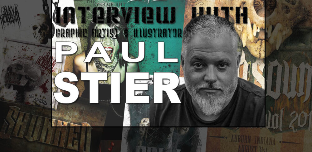
Interview with album cover artists Paul Stier
Paul Stier is a very talented and accomplished graphic artist who has done some amazing album cover artwork in the last few years. Check it out!

Interview with album cover artists Paul Stier
by Josh Drespling
In an effort to give you, the readers of Empire Extreme a peek behind the curtain of the music industry we have been cultivating interviews with the people who you don’t see on stage and receiving the adulation of the fans. These are all people who are integral parts of the music industry and often have very unique perspectives on the things you and I take for granted as a casual listener.
For this installment we caught up with Paul Stier, a very talented and accomplished graphic artist who has done some amazing album cover artwork in the last few years. Check it out!
You do a lot of work for Rottweiler Records. How did you get involved with Shawn Browning and Rottweiler?
Well, Shawn and I have been great friends since 2000, and we live in the same town, so when he decided to start Rottweiler Records, he asked if I would do the cover art for their bands, and of course, I said I would. I had already been doing quite a bit of work for his former band The Migraines, and also for Grave Robber. Grave Robber’s second record “Inner Sanctum” was the very first album cover art I ever made, and was released on Retroactive Records. Once Rottweiler got underway, I had the opportunity to create the label’s logo and the art for their very first release, Behold The Kingdom’s “The Eyes Of The Wicked Will Fail.” Shawn has since used other graphic artists, but anytime I want to do a project, he usually gives me first crack at it, and I am very thankful for that.
When you are asked to do an album cover and/or entire package how do you attack it? What is your process? Do you start out sketching with pencil and paper or do you dive right into the digital world?
I attack it with full brute force, like any good metalhead would do! Seriously though, the first thing I do is pray and ask God to make the project what He wants it to be. I pray for creativity and imagination; I’m not stupid, I know where the gifts come from. I will start talking with the band I’m working with, and ask what they see the art looking like in their head, and take clues from what they tell me. I like to put those elements in the art if possible, because the band is as much a part of the creative process as anyone or anything else. I look for outside inspiration, which could be music, movies, art galleries, anything really. I will share my thoughts with my wife, Angie, and she will throw out ideas I never thought of. She is a huge inspiration. I will sit and ponder what I have absorbed, get excited about it and then jump right in on the computer and start working, but then there are times when I get a project, and I’m just pumped to get started. The ideas are there at that very moment, and I go with it. Every project is different on that level.
I know I use a mix of both Photoshop and Illustrator when I design things. Some things work better with one rather than the other. With that being said, what is your software of choice or at least what is your starting point?
I would have to say my software of choice is definitely Photoshop. It allows me to manipulate photos and textures better than any other program that I have tried, but yes, I do use Illustrator for CD package layout and also for text. Using the layout templates in Illustrator is more accurate and the text is much smoother and prints better because it is vector based. However, if you are incorporating a band logo and album title into the art, I recommend doing that in Photoshop while you are creating the art so it has a balanced feel and looks like it belongs there. That is what I like to do. I will add dimension, texture and lighting from the art on the logo and the title, but I have to play with it a little to make it pop visually. Contrast is key. I use text only in Illustrator for the lyrics, liner notes, catalog number and
legal jargon most of the time.
Your style has an aura of shall we say “grungy-realism”. How has that developed and/or changed over the years.
I’ve always been drawn to grungy art. Even as a kid, I found beauty in the imperfect. Through the years, it is something that I had to learn slowly. I absolutely loved the work of the Clark brothers at Invisible Creature (then Asterik Studio) and the art of Travis Smith, but had no idea how to create it. I remember sending Don Clark an email asking him how they achieve that grungy look, but he didn’t exactly tell me, he just told me to look into Photoshop brushes and textures, and that’s all the advice I got. But that’s all it took. I just ran with it and studied everything I could get my hands on that would teach me. What I soon realized was that it is all experimentation, trial and error. There are no hard fast rules, just try stuff and have fun with it. The only thing that I would say has changed, is that I have learned to balance the grunginess in my work. To tweak it so it’s noticeable and obviously there, but not go overboard and have too much dirt that the contrast overpowers the piece. I strive to create a clean grungy look. Dirty and professional, if that makes sense.
Some of your work looks like it incorporates photographic images, for example the woman in the “Behold the Kingdom” piece and the Grave Robber “You’re All Gonna Die” album cover. Is that a correct assessment and if so how did that process work?
You are correct. It’s all about thinking ahead. To set everything up as much as possible so it looks more realistic and you have less to do in Photoshop. The woman on the Behold The Kingdom album cover is a friend, and I snapped some shots of her standing on a ladder in her parents house. I think they thought I was crazy, but it all worked out ok. The Final Surrender cover featured Shawn’s son, Jesse. The Grave Robber one was a lot of fun to photograph; that is my son on the cover. The shed, the shovel, the rope, and him were all purposely staged and photographed, just as it looks. Everything else was done in Photoshop.
When given a project, how much freedom do you usually have?
When I first started working with Shawn and Rottweiler, I honestly didn’t have a lot of freedom. Shawn knew what he wanted and I complied, but as time went on, I wanted more creative freedom, so I had to prove myself. I had to convince him and the bands that if they wanted better, more eye catching art, that they would have to give me more freedom. They finally agreed, and they loved the results. Now, I have plenty of freedom and it’s been great.
Describe the feeling you get when a client asks for revisions the first time, second time, third… fourth…
I’ve been very lucky; I don’t have that very much. If I have revisions, it’s usually only one or two small things that need changed or deleted, but that’s about it.
What made you first want to get into illustration and design?
As a teenager, I would sit and listen to records and study the details of the cover art. I would wonder, who did this amazing work? It was part of the listening experience for me, a very important part. I always thought it would be cool to make album cover art, but didn’t know how, or even the first steps to learn. Later on in my late twenties, I worked at a Kinko’s and I saw my manager designing a poster for an event, and I asked him how he did that. He gave me a copy of CorelDRAW/CorelPAINT and told me to install it on my computer at home and just start playing with it. So, that’s exactly what I did, and I have to admit, my early designs were horrible. I got some pointers from people in the business, and eventually purchased Photoshop. That’s pretty much how it started, and now I’m doing what I love as a self taught, freelance artist.
You recently did the cover for the book Fear Mountain, can you tell us what went into that project and the concept for the cover.
Yeah, the author or Fear Mountain, Mike Dellosso put out a request for art on Facebook, so I contacted him, and he was very interested in my work. He asked designers to donate their time and talent to this project because the proceeds from the book were going to help him and his wife adopt a child. I just couldn’t say no to that. It was a special edition ebook, and he used work from four different artists. I am so humbled to be a part of that project. The concept for the cover is a surreal interpretation of
the story line.
You also did the album cover Lust Control’s second album in 30 some years. That artwork differs from a lot of your other material. Can you explain why and tell us a little how that project came together along with what it was like working with the infamous Doug VanPelt?
Doug wasn’t completely sure I was the man for the job at first. I called him one evening to discuss the art, and he asked me to describe what I would create for the cover. He wanted to see if we were on the same page. He told me the title was “Tiny Little Dots,” so being that I already knew what Lust Control was about and what their message was, I described to him what ended up being the cover. He loved the concept and let me know that I was the guy to create it. Doug is awesome! I can’t say much more than that…I love that dude!
Some people draw and create for fun, what do you do?
All kinds of things. I love going to concerts, watching movies, listening to music, reading, and creating. Sometimes, my wife and I will snag a photo of each other and try to create the goofiest designs of each other. The last time we did this, she ended up with a mop head for hair, and I ended up with a ramen
noodle afro. She definitely won that round. It was awesome!
Any new and exciting projects on the horizon you would like to mention?
I just finished the album cover for an amazing thrash metal band called Hand Of Fire on Rottweiler Records, and I am also getting ready to start working on art for the new Grave Robber record. I want to make this one is very different from the previous work I’ve done for them. I can’t wait for you all to see it.
If I’m a band or business looking for some stunning artwork, how can I get a hold of you?
You can contact me on Facebook at www.facebook.com/thesavageyard, or email me at thesavageyard@gmail.com
[Best_Wordpress_Gallery id=”30″ gal_title=”Paul Stier Artwork”]
About Author

Interviews
INTERVIEW WITH RENN HAWKEY OF THE YAGAS


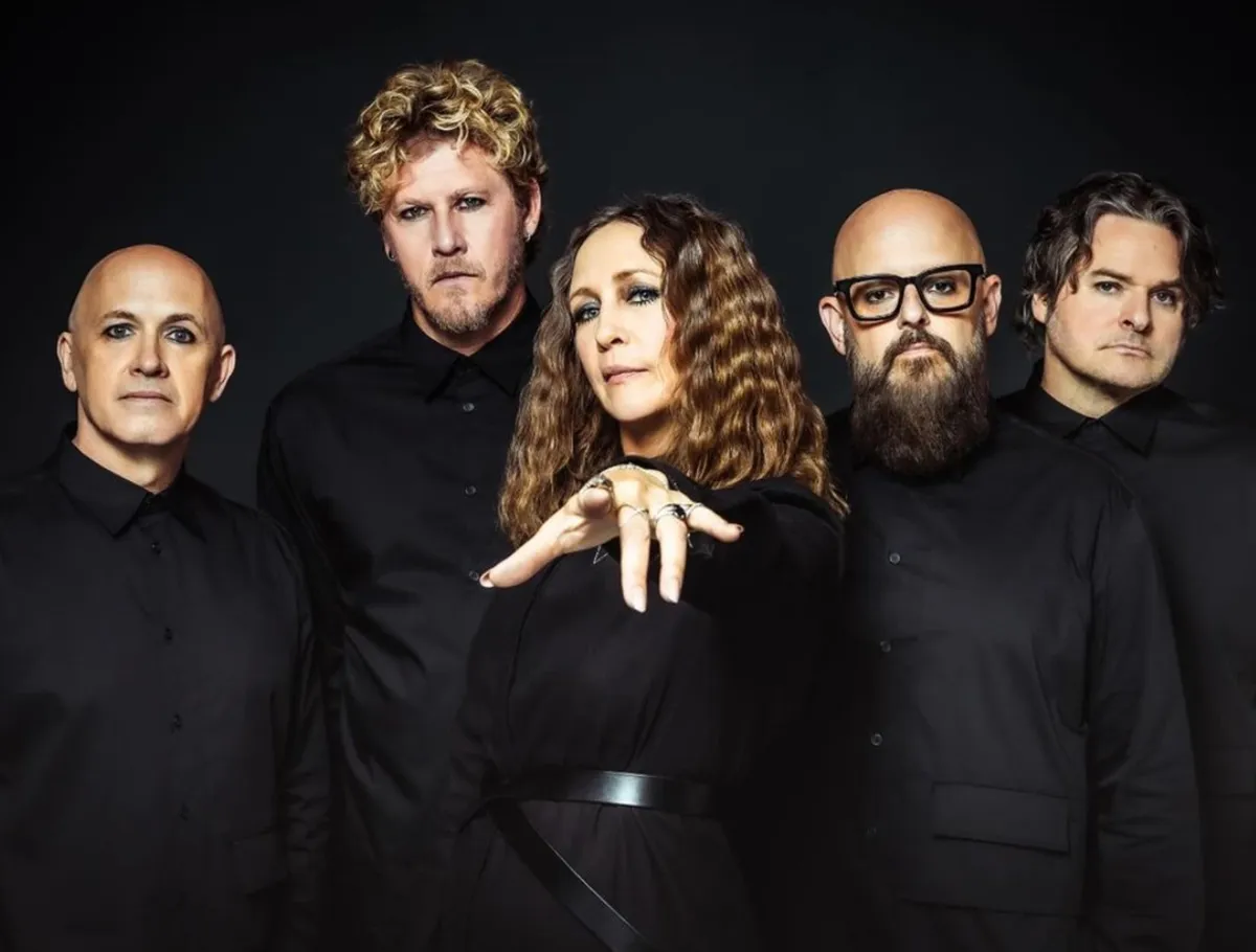
The Yagas are a new rock band fronted by actress Vera Farmiga and her husband Renn Hawkey (of Deadsy ).
The album Midnight Minuet just debuted and it’s an amazingly haunted and beautiful journey throughout many emotions. 10 songs that doesn’t label itself to any genre.
Empire Extreme got to talk to Renn about the album, its creation and life within music, art and film.
About Author
Interviews
Interview with Michael Rubin of King Falcon

EMPIRE EXTREME GOT TO TALK TO MICHAEL RUBIN OF KING FALCON ABOUT ALL THINGS ROCK AND ROLL.
About Author
Interviews
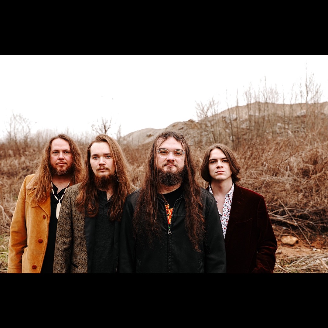
INTERVIEW WITH BOONE FROGGETT OF OTIS

EMPIRE EXTREME GOT TO TALK TO BOONE FROGGETT FROM THE BAND OTIS, FROM KENTUCKY MUSIC TO HORROR MOVIES. CHECK IT OUT.
About Author
-

 Concert Reviews8 months ago
Pride in the Pit
-

 Concert Reviews1 year ago
MARTY FRIEDMAN LIVE DRAMA TOUR 2025: RAMSHEAD ON THE STAGE
-

 Concert Reviews1 year ago
APOCALYPTICA PLAYS METALLICA VOL 2: DC SHOW REVIEW
-

 Concert Reviews12 months ago
KIM DRACULA/Hanabie SilverSpring Maryland Show Review
-

 Announcement/News1 year ago
MACHINE HEAD TOUR 2025


You must be logged in to post a comment Login